Unemployment rates don’t tell the full story of what’s really happening in our economy—what explains that “hollowing out” feeling Iowans have gotten over the last decade and a half.
But labor force participation (LFP) rates can.
The LFP is how many folks in a community are of working age (16 and older is how the federal government defines it) and are actively looking for work. That’s different from the unemployment rate, which only measures those who don’t have jobs but are actively seeking one.
So when places like Iowa see more of our young people moving out, with only retired folks staying, the unemployment rate won’t show that. But the LFP will.
Which is why the LFP can be directly tied to economic growth.
So when I saw a video on Twitter showing how LFP across the country has changed, I finally had proof of the anecdotal feeling we were all getting in Iowa these last 15 years.
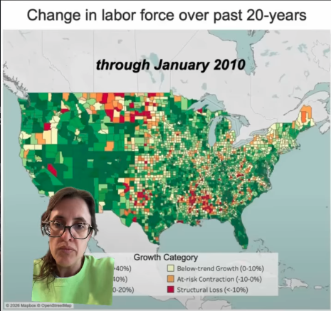
The map above shows a mixed, if overall growing, labor force in Iowa in January of 2010. Areas in dark green have a higher-than-average growth rate, while lighter green is still growing at or above the national average. Areas in yellow, orange, or red are varying levels of below-average growth, contraction, or “structural loss.”
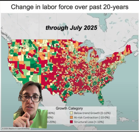
The map below is a lot redder.
Watch the latest edition of Clocked In on:
Has your county gone the other direction, with more people leaving than staying? What’s that been like to witness? Tell me your experience.